



Why registration forms are harder than signup forms
A newsletter signup needs one field. A registration form needs real operational data — which session, which ticket, dietary requirements, accessibility needs, a company name for the badge — and every one of those questions costs you registrations.
That tension is the whole problem. You cannot solve it by cutting questions you genuinely need. You solve it by changing the order you ask them in.
Step 1: Separate identity from details
.avif)
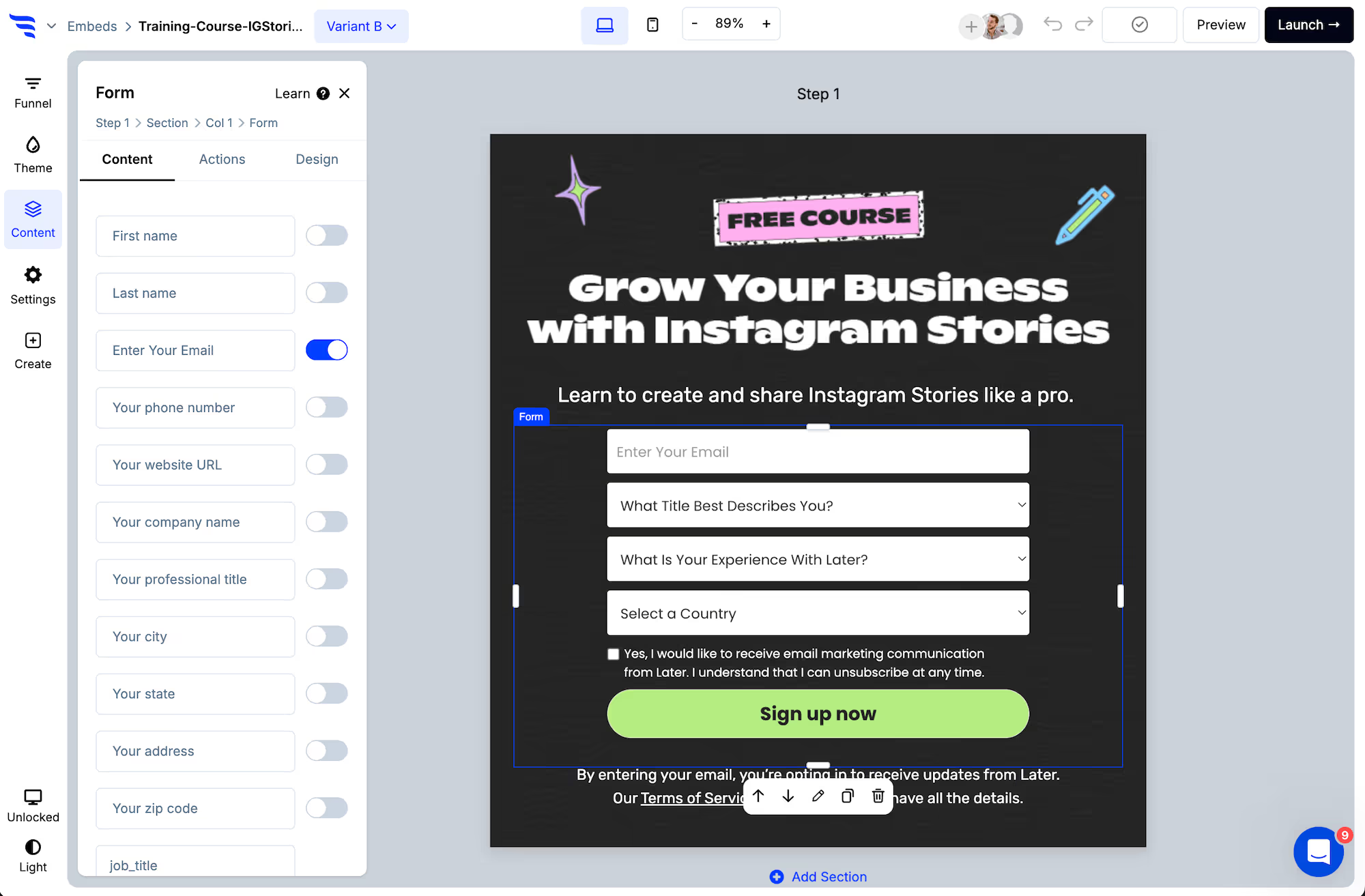
Step one asks for name and email. Nothing else.
.png)
The reason is not conversion theatre. Once the email is captured, someone who abandons on step three is still a registrant you can email — you can follow up and finish their registration for them. On a single-page form, that person is nothing at all.
For most events, a partly completed registration you can chase is worth more than a shorter form.
Step 2: Ask the operational questions in the right order
.avif)
Order them by how invested the person is by the time they arrive:
- Choices first. Session, ticket type, date. These feel like part of the decision rather than admin, and the answer determines what you ask next.
- Constraints second. Dietary requirements, accessibility, plus-ones. People answer these once they are committed.
- Marketing questions last, and optional. Job title, company size, how they heard about you. Useful to you, worth nothing to them. Anything mandatory here is costing you attendees.
Step 3: Branch by ticket type
.avif)
A virtual attendee does not need a dietary question. An in-person attendee does not need a timezone. Conditional steps skip what does not apply, which is where a multi-step registration form gets genuinely shorter rather than just feeling shorter.
The same logic handles free versus paid tiers, member versus non-member pricing, and speaker or sponsor registrations that need a different set of questions entirely — all from one form.
Step 4: Verify the email address
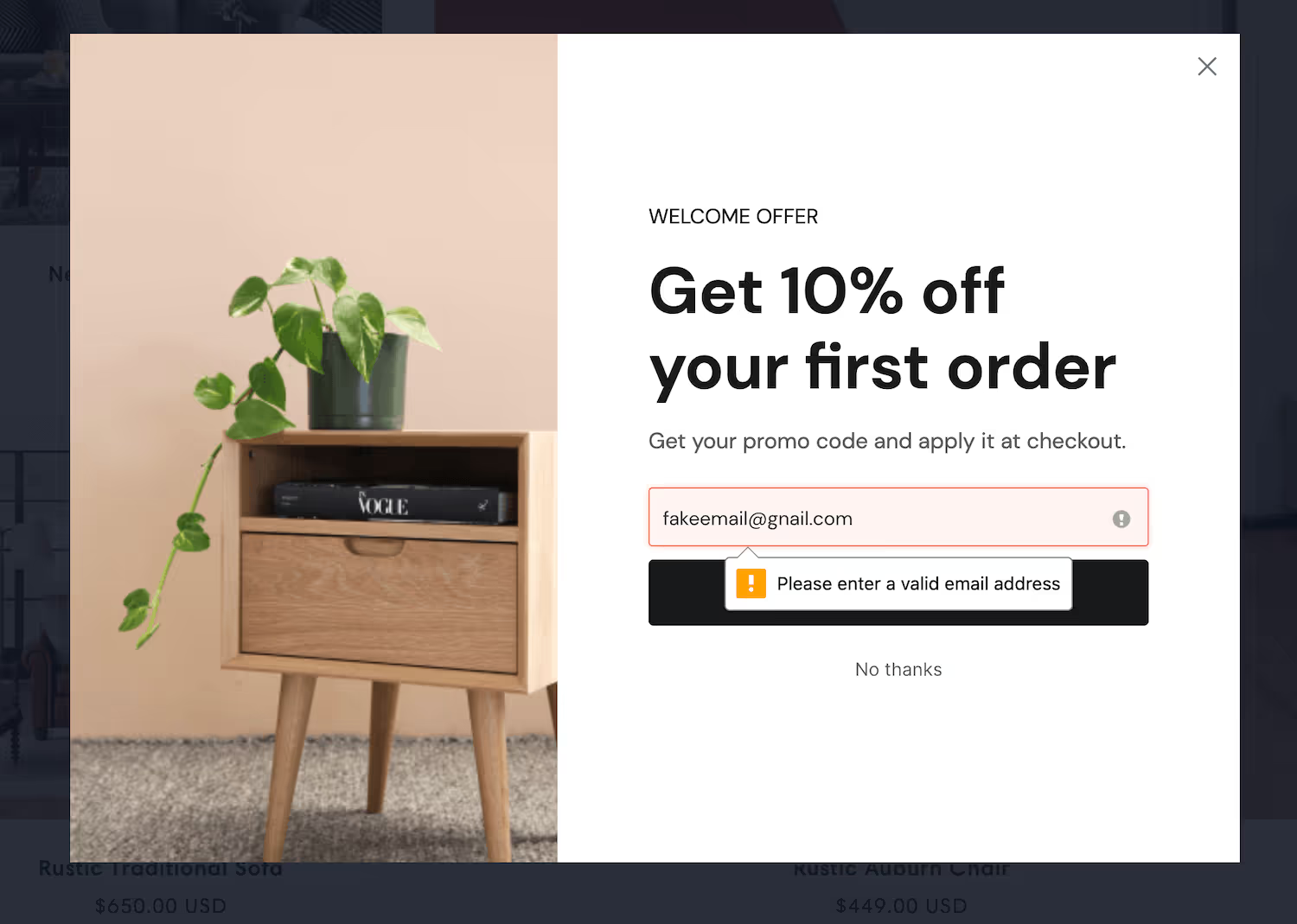
Registration is the one form where a mistyped address is unrecoverable. The joining link, the calendar invite and the reminders all go to an inbox that does not exist, and the person turns up to nothing — or more likely, does not turn up at all and blames you.
Verification catches it while they are still typing, which is the only moment you can.
Step 5: Confirm on screen, not just by email
The confirmation step is the most under-used part of a registration form.
Put the joining link, the date and time in the reader's own timezone, and an add-to-calendar button directly on the screen — before they close the tab. Confirmation emails land in promotions folders. The confirmation step cannot be missed.
This is also where a calendar add matters most: a registration that reaches someone's calendar attends at a materially higher rate than one that only reaches their inbox.
Step 6: Sync and tag the source
.avif)
Push registrants to your CRM or email platform with a tag recording which event and which channel brought them. Over several events that tells you which promotion actually fills seats, rather than which one generates clicks.
Step 7: Registration is not attendance
.avif)
The number worth optimising is attendees, not registrations — and the gap between them is usually large, particularly for anything free.
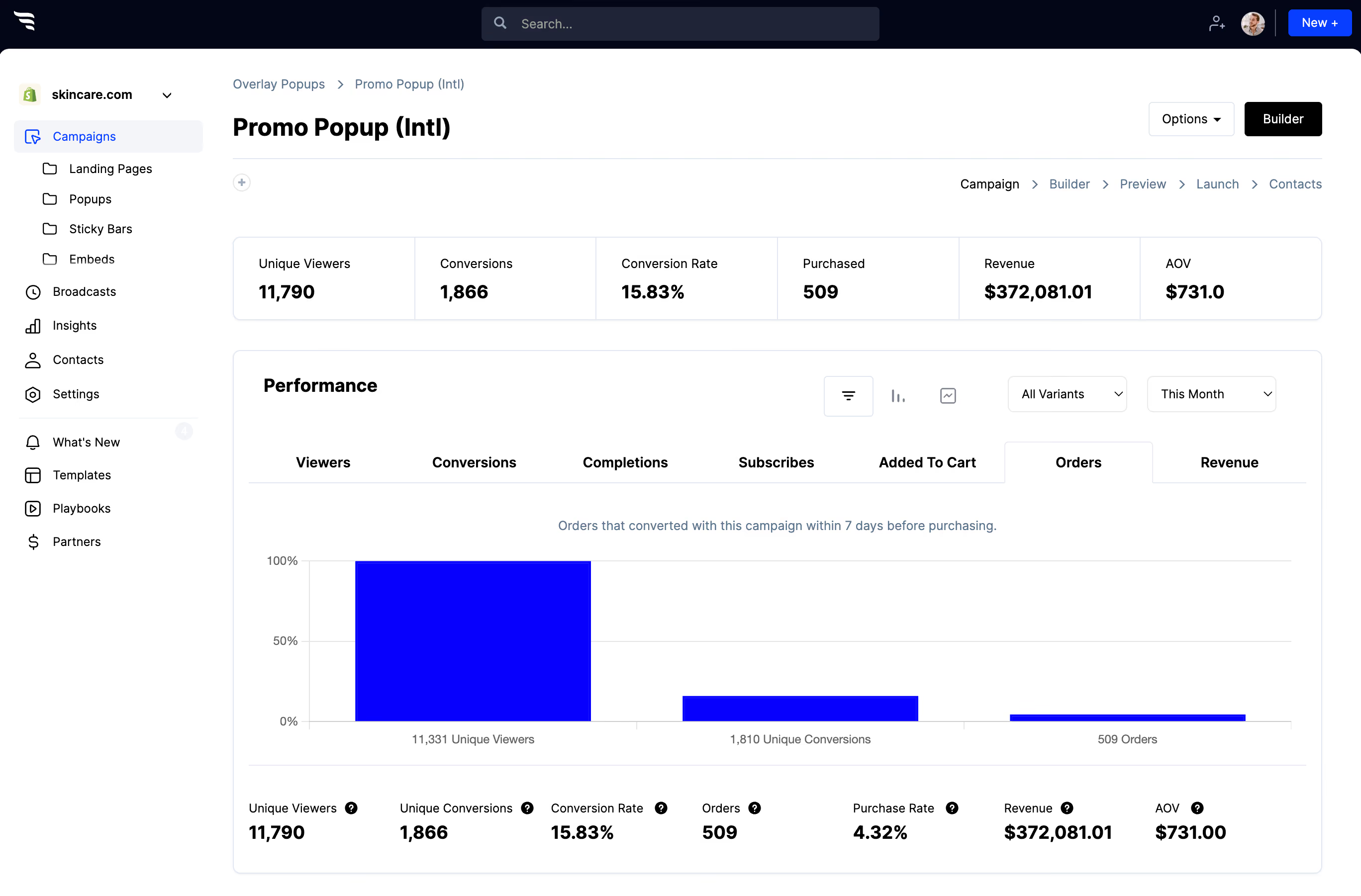
Read the per-step drop-off to see which question loses people, then act on it: move it later, make it optional, or cut it. A steep fall on one field is almost always a question asked too early rather than a question asked badly.
When a single step is better
If you only need a name and an email — a free webinar with no options, no tiers and no logistics — do not split anything. Multi-step earns its complexity when you have real questions to ask. On a two-field form it just adds a click.



%20(1).avif)






.svg)
