



What an opt-in form has to get right
An opt-in form does one job: turn a visitor into a subscriber. Everything else — design, placement, offer — serves that.
Three things decide whether it works, and only one of them is the form itself.
- The offer. What someone gets for subscribing. This moves the number more than any design change.
- The ask. How much you require. Every field beyond the email address costs completions.
- The consent. Whether it's explicit, recorded, and matches what you'll actually send.
Step 1: Start from a template
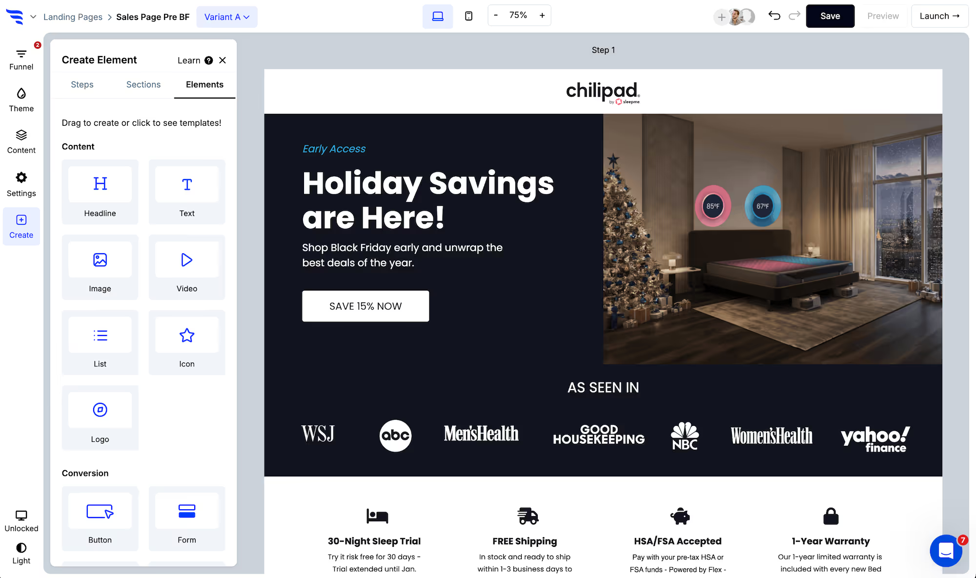
Add an opt-in form to a landing page, popup or embed. Click to add an element and choose the form type, then start from a template or build from scratch.
.avif)
Step 2: Keep the ask small
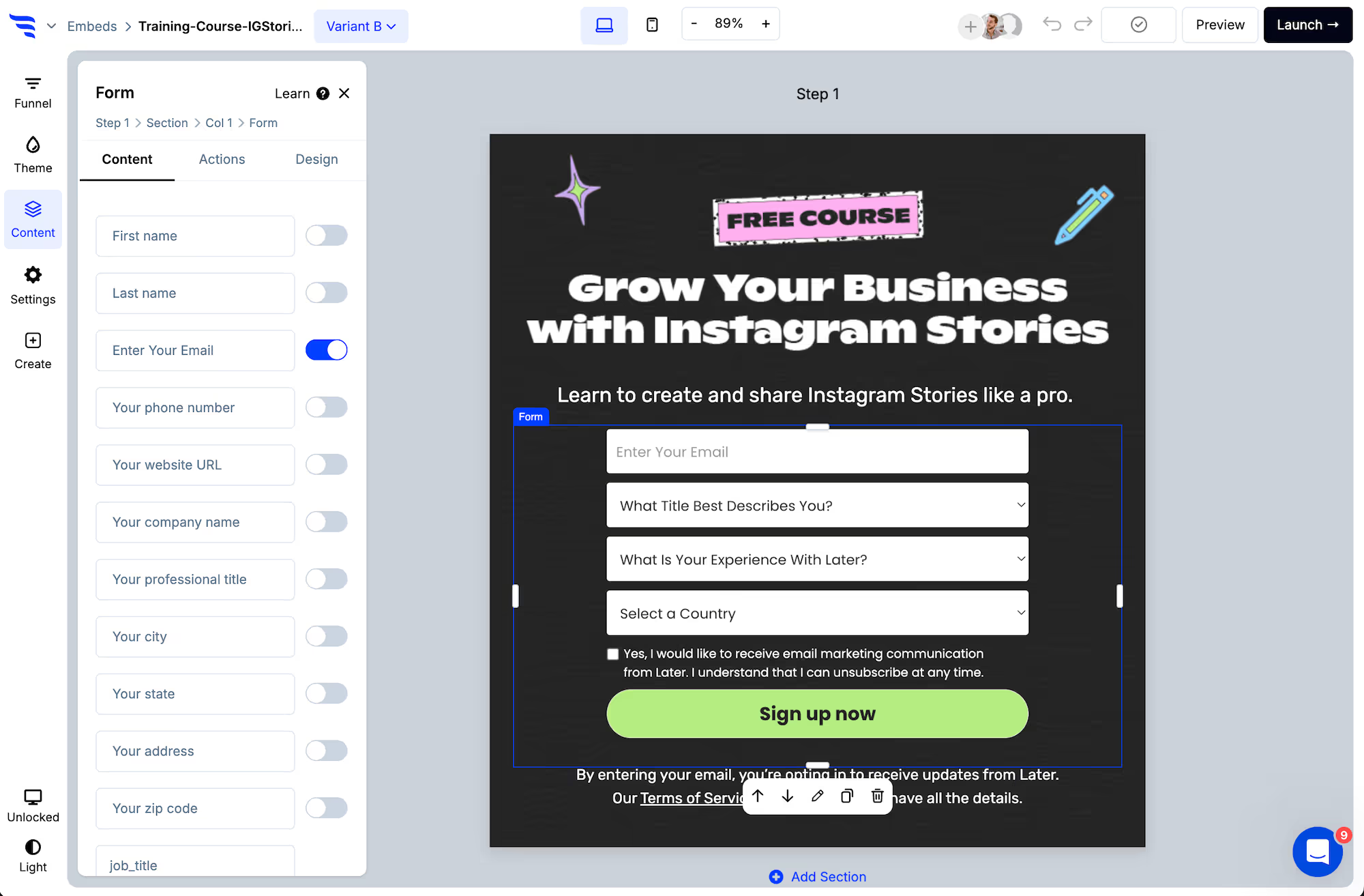
Toggle on the fields you want — and toggle on fewer than you think.
.png)
An email field alone converts best. First name is the common second field and it's usually worth it, because personalization in your sends depends on it. Beyond that, each addition should be justified by something you'll actually do with it.
Every field can be edited from the builder panel — placeholder, label, required state.
.avif)
Step 3: Handle consent properly
Below the preset contact fields you'll find dedicated privacy, marketing and SMS consent checkboxes, with links to your privacy policy and terms.
Three things worth getting right:
- Explicit beats implied. A checkbox the person ticks is stronger evidence than small print under a button.
- SMS consent is separate. Agreeing to emails is not agreeing to texts, and a general privacy checkbox doesn't cover either.
- Match the promise to the sends. If the form says "monthly newsletter" and you send three a week, the opt-in doesn't cover what you're doing.
Requirements differ by region and change over time, so confirm your wording against your own obligations rather than copying another site's.
Step 4: Verify the address before it syncs
Real-time verification checks that an address exists with its provider before the subscriber is created.
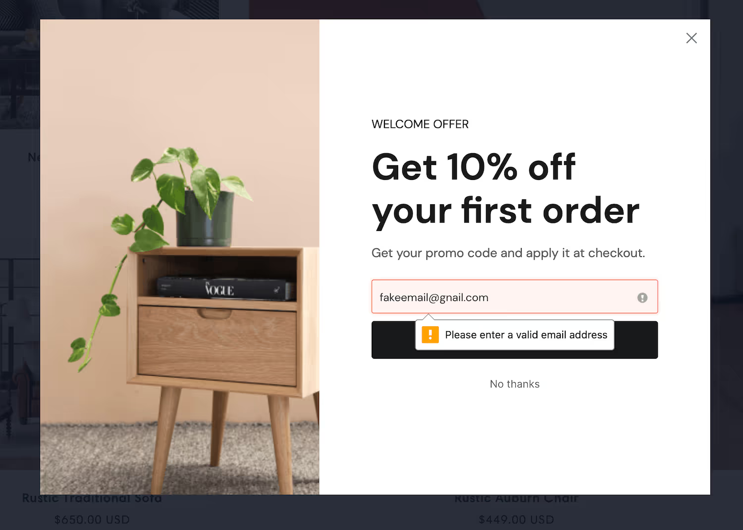
This protects the number you'll be judged on. Undeliverable addresses drag down your open rate, count against your subscriber total, and on some platforms damage sending reputation.
Step 5: Decide single or double opt-in
Most email platforms let you choose, and the decision belongs at the platform rather than the form — but it changes what your form should say.
Single opt-in adds everyone who submits. Highest volume.
Double opt-in requires a confirmation click before the subscriber is active. You lose part of the list and gain one where every address is confirmed reachable.
If you're using double opt-in, say so on the confirmation step. A confirmation email that arrives unannounced gets ignored, and an ignored confirmation means the subscriber never activates — you paid for the traffic, collected the address, and ended with nothing.
Step 6: Style it to belong
In the Design tab, set spacing, field layout, width, fonts, button colour and roundness, field colour and shadows.
.avif)
Set the theme first and every element inherits it, including ones you add later.
Step 7: Sync the subscriber
In the Actions tab, choose what happens on submit, then add the automation that adds the subscriber to the right list in your email platform.
.avif)
Use a different list or tag per placement. Someone who opted in from a blog post and someone who opted in from a product page are at different stages, and sending them the same welcome sequence wastes the distinction.
Step 8: Ask the segmenting question after, not before
This is the pattern that gets you segmentation without paying for it in signups.
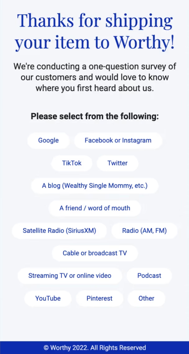
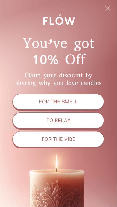
Keep step one to the email address. Then, on the confirmation step, ask one question — what they're interested in, what brought them here. Map the answer to a field or tag.
.avif)
People who answer give you a segment. People who skip it are already subscribed. You lose nothing either way.
Step 9: Suppress it for existing subscribers
With your email platform connected, exclude anyone already on your list.
Existing subscribers are your most frequent visitors, so an untargeted opt-in form is shown disproportionately to people who cannot convert on it. Excluding them raises your measured conversion rate and stops your most loyal readers being asked to subscribe on every visit.
Step 10: Test the offer before the design
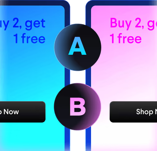
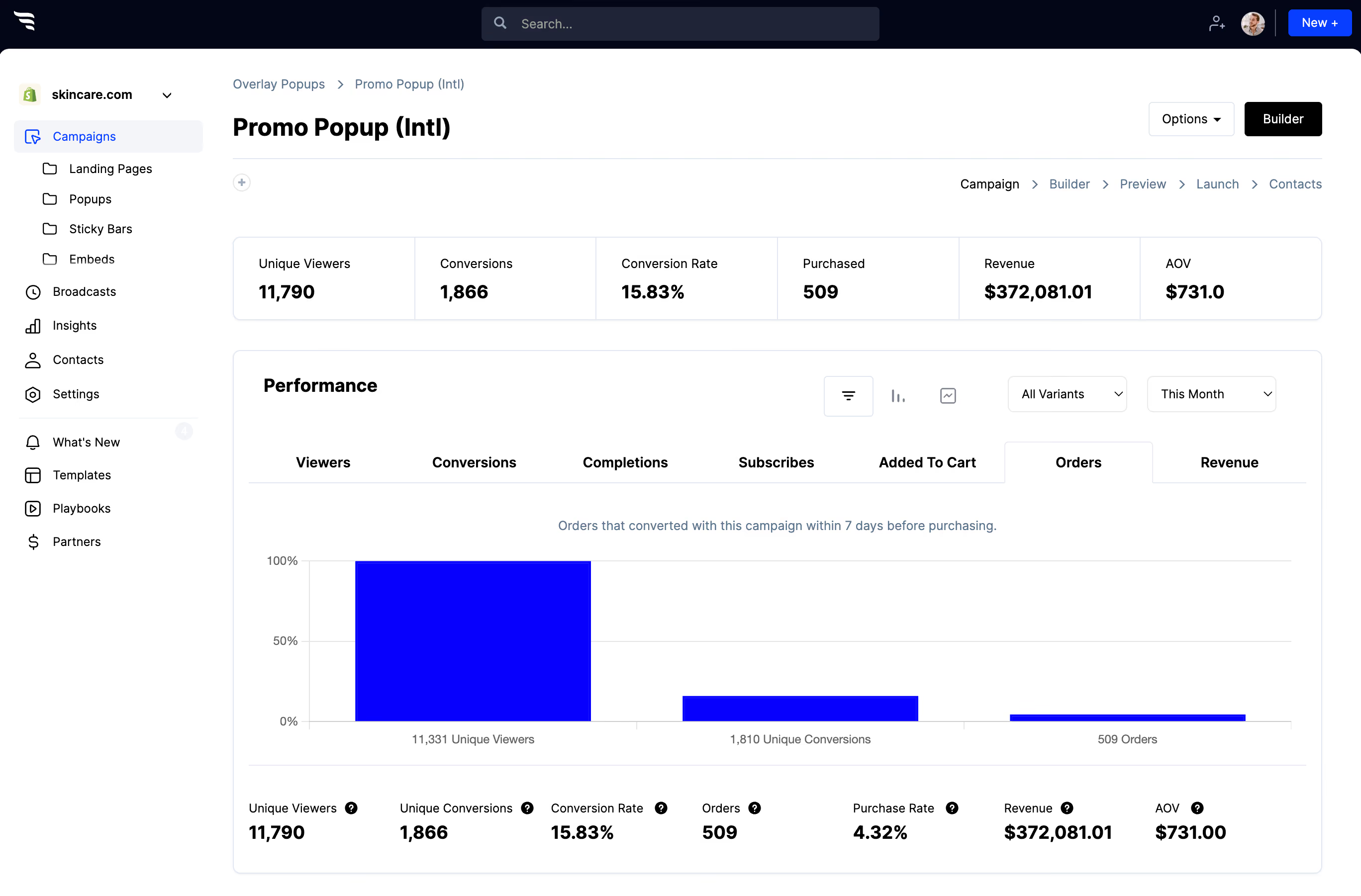
Split traffic between variants and read the funnel report.
.avif)
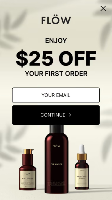
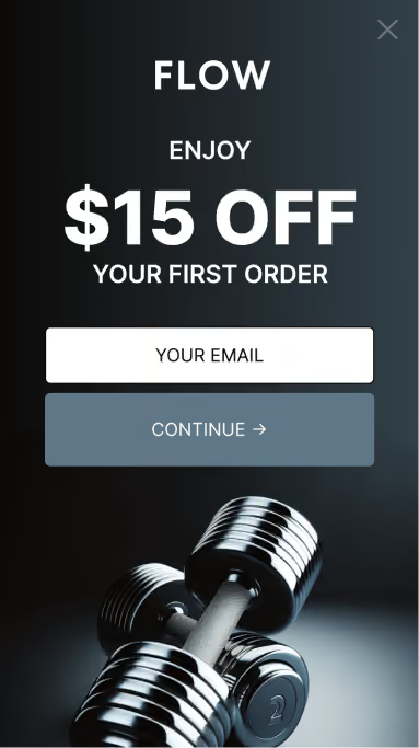
Most teams test button colours. On opt-in forms the offer and the field count move the number far more — test those first, and come back to the design once they're settled.



%20(1).avif)




.svg)
