



An application form is a screening tool
That's the difference between an application and a contact form. A contact form succeeds when someone submits it. An application succeeds when the right people submit it and you can tell them apart afterwards.
Which means the two instincts people bring to form design are both wrong here. Making it shorter gets you more applicants you have to reject. Making it longer gets you fewer applicants and no better information.
What actually works is asking the disqualifying questions first and the effortful ones last.
1. Put the deal-breakers on step one
Every application has two or three answers that decide the outcome on their own — budget, timeline, location, licence, eligibility. Ask those immediately.
It feels backwards, because you're inviting people to drop out. That's the point: someone who leaves on step one because they don't qualify has saved you a review, and someone who continues has told you they're worth reading.
2. Split it across steps, with contact details early
A twenty-field application on one page reads as paperwork. The same questions across five steps read as a process, and far more people finish.
Ask for name and email on the first or second step — not the last. An application abandoned at question twelve is still a lead you can follow up if you have the address. On a single-page form it's nothing.
3. Branch instead of asking everyone everything
Applications are where conditional logic earns its keep. An applicant who selects one programme, tier or service never sees the questions that only apply to another.
This is the only way to make an application genuinely shorter rather than just visually shorter.
Step 1: Build the form
.avif)
.png)
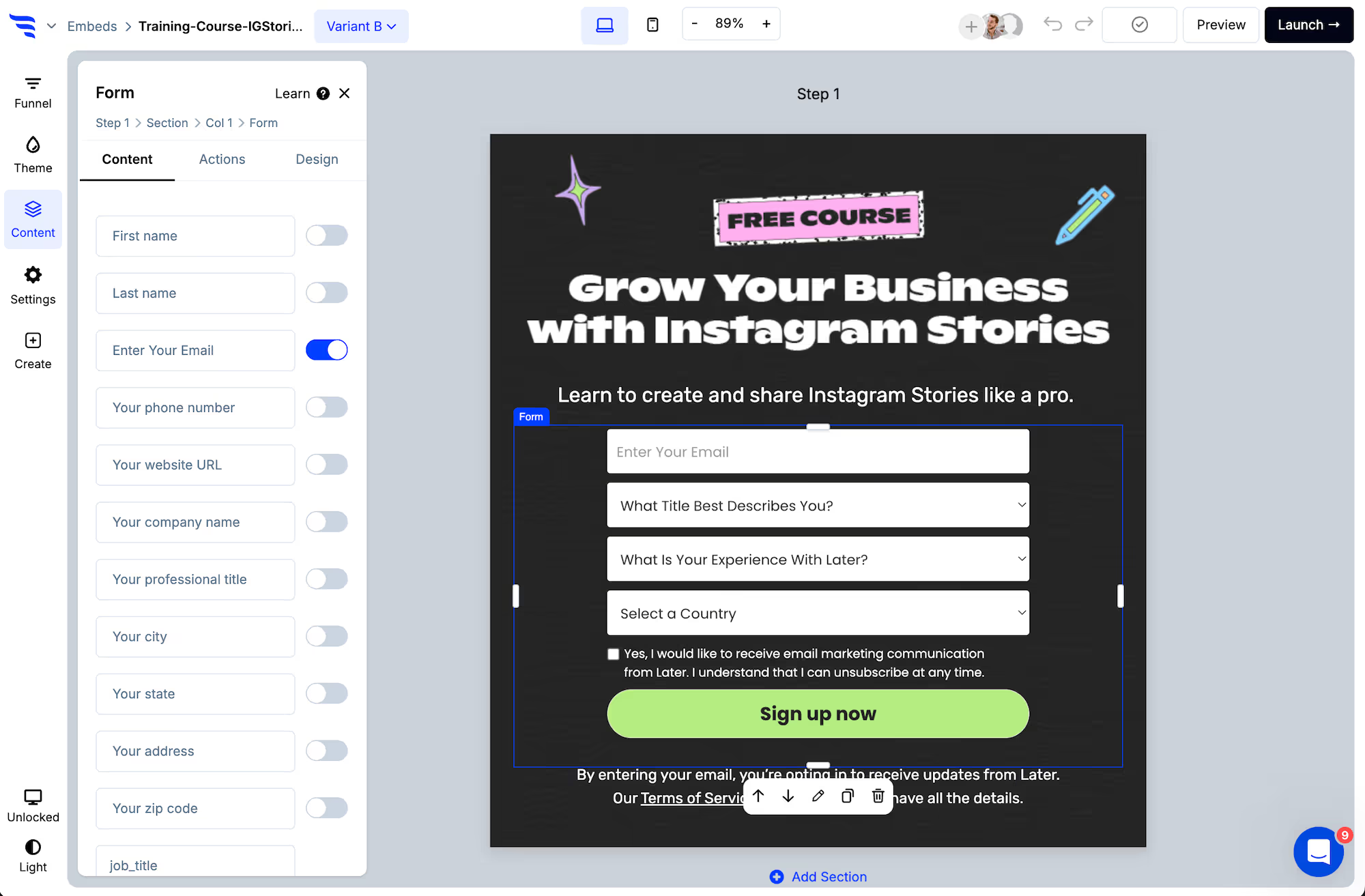
Toggle the contact fields you need, then add custom fields for the application questions — text, dropdown, radio, checkbox, paragraph, numerical or range.
.avif)
Use dropdowns and radios for anything you'll later filter or sort on, and keep the answer values short and consistent. Paragraph fields are for the one or two questions a human will genuinely read — every extra one is a field nobody sorts by and everybody has to write.
Step 2: Handle documents in the follow-up
Applications often need a résumé, portfolio, licence or proof of something. ConvertFlow forms collect answers, not file attachments — so don't design the application around an upload that isn't there.
Ask for the document on the confirmation step or in the automated follow-up email instead, once you already have the applicant's details. In practice this is also better screening: the people who send the file are the ones who are serious.
Step 3: Verify the contact details

An application you accept and then can't deliver the decision to is worse than one that was never submitted. Verify the email and phone number as they're typed.
Step 4: Show how much is left
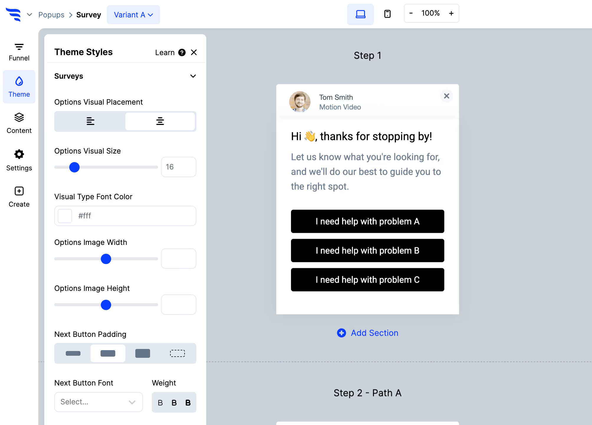
A multi-step application with no progress indicator is an unknown amount of work, and unknown work is what makes people close the tab at step three.
Step 5: Route by the answers
.avif)
.avif)
This is where an application form stops being a form. Conditional actions let you send qualified applicants straight to a booking step and everyone else to a holding response — without a person triaging the queue first.
Step 6: Map every answer to a field
.avif)
Applications are only reviewable in bulk if the answers are data. Map each one to a property on the contact record in HubSpot, Salesforce or whatever you review in — not into a notification email someone has to read and retype.
Once the answers are fields, you can sort the pile.
Step 7: Decide on the confirmation step
If the application qualifies someone outright, say so and book the next step there and then. The applicant is engaged at the moment they hit submit and less engaged every hour afterwards.
If it needs review, say when they'll hear back and hold to it. Applications are a two-way judgement — a vague "we'll be in touch" loses the good applicants first, because they have other options.
Step 8: Cut the questions nobody reads
.avif)
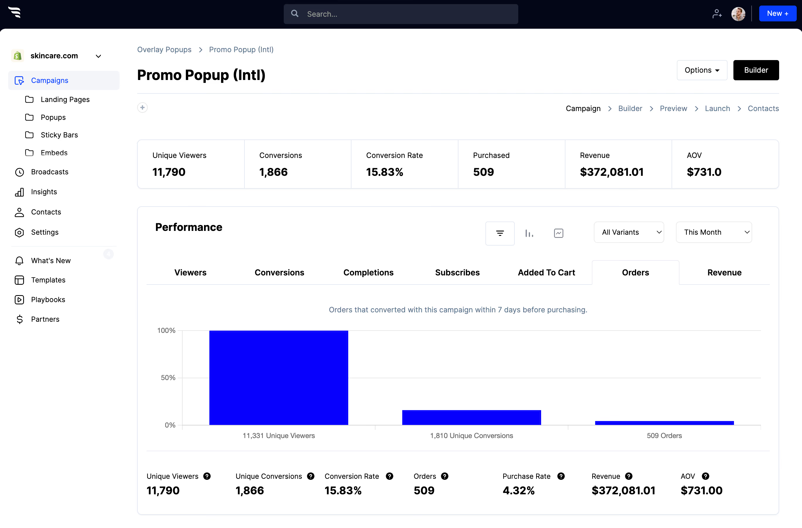
The funnel report shows drop-off step by step, so you can see which question is costing you applicants.
Then apply the test to every field: when did someone last make a decision based on this answer? On long-standing application forms the answer is often never — the question was added by someone who no longer works there, and it has been quietly costing you applicants ever since.



%20(1).avif)






.svg)
