



What moves newsletter signups
Three things, in order of impact — and design isn't one of them.
- What you say the newsletter is. "Subscribe to our newsletter" is the weakest offer available. A specific description of what arrives, and how often, beats it substantially.
- How little you ask. One field. Every addition costs subscribers.
- Where it appears. Placement that follows engagement beats placement that interrupts it.
Step 1: Build the form
.avif)
.png)
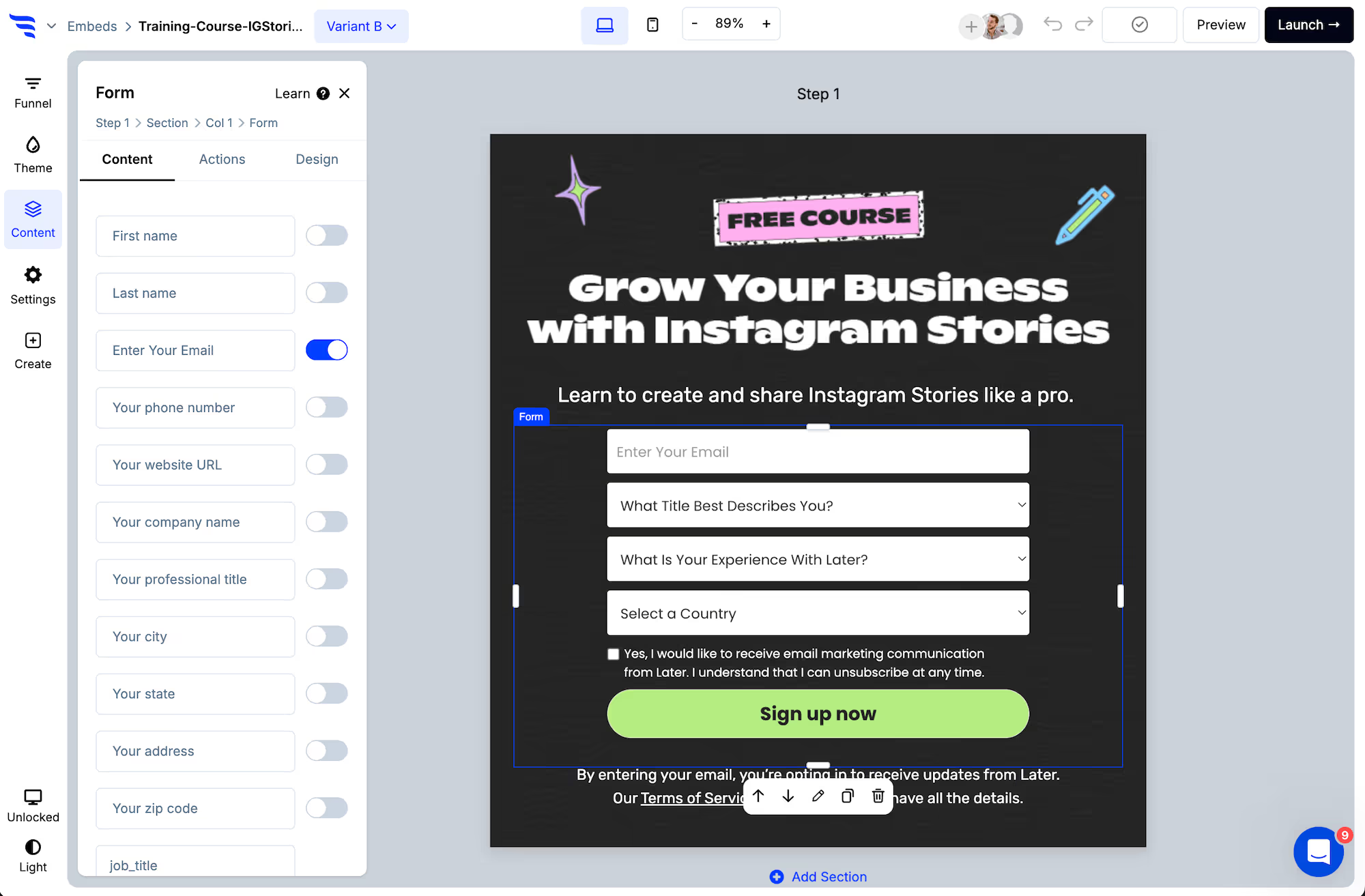
Email field only. First name is the one defensible addition, and only if you'll actually personalize sends with it.
Step 2: Say what they're getting
Replace "subscribe to our newsletter" with what the newsletter contains and how often it arrives.
This is the single biggest lever and it costs nothing. "A short email every Tuesday on X" outperforms a generic prompt reliably, because it answers the question the reader is actually asking.
Step 3: Verify the address
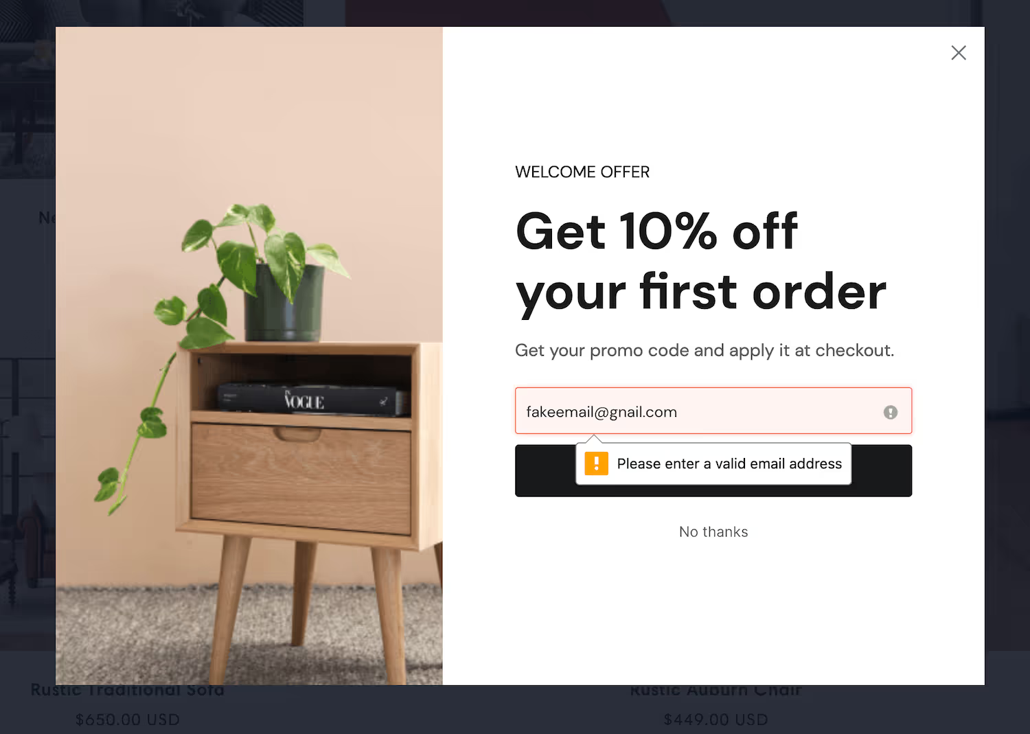
Undeliverable addresses drag down the open rate you'll be judged on, count against your subscriber total, and on some platforms damage sending reputation.
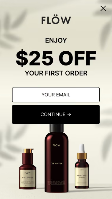
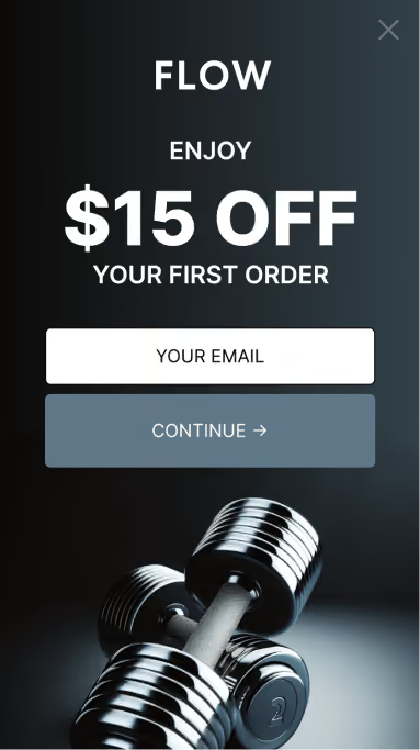
Step 4: Style it to the site
.avif)
Step 5: Place it where engagement already is
Ranked by what generally works on a content site:
- Partway through or below a post — the reader has demonstrated interest
- Scroll-triggered popup at around 70% — same logic, more visible
- Exit-intent — catches people already leaving
- Sidebar or footer — low yield, zero friction, worth having
The footer-only newsletter form is the most common setup and the weakest.
Step 6: Sync and tag by placement
.avif)
Add the automation that subscribes them, and apply a tag recording where they signed up. Over time that tells you which posts and categories actually produce subscribers.
Step 7: Segment after signup, not before
.avif)
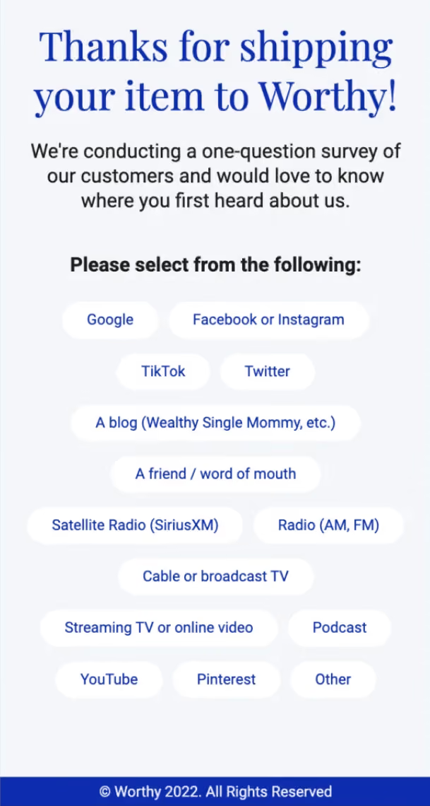
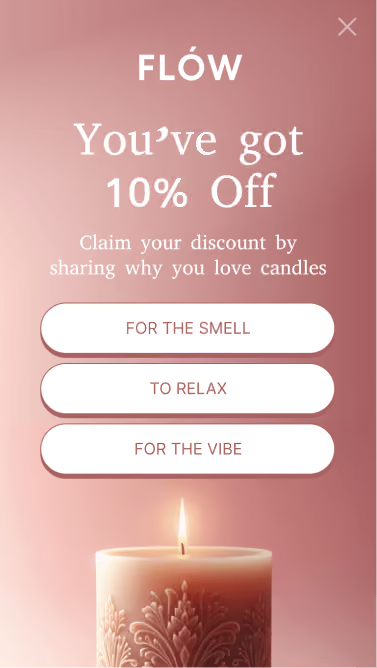
Ask one question on the confirmation step — what they're most interested in — and map the answer to a tag. You get segmentation without charging for it at the point of signup.
Step 8: Hide it from subscribers
Exclude anyone already on your list.
Your regular readers visit most often, so an untargeted newsletter form is shown mostly to people who already subscribed. Excluding them stops the nagging and makes your conversion rate a number measured against people who could actually convert.
Step 9: Test the description first
.avif)
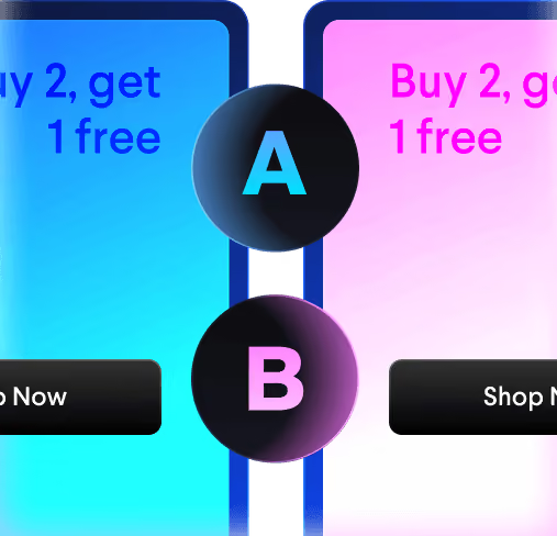
Split-test what you say the newsletter is before testing anything cosmetic. Frequency claims in particular move the number more than most people expect — in both directions.



%20(1).avif)





.svg)
