




Why mobile surveys need different design
Most survey advice was written for desktop. Three things genuinely differ on a phone, and they change the design rather than just shrinking it.
- Typing is the friction. A text field that's trivial on a keyboard is a real cost on a phone.
- The screen is small and the keyboard takes half of it. A survey that fits on load may not fit once someone taps a field.
- Interruption is more expensive. A full-screen survey on mobile is the pattern search guidance penalises, and it's harder to dismiss.
Since most traffic is mobile, these aren't edge cases — they're the default case.
Step 1: One question, tap to answer
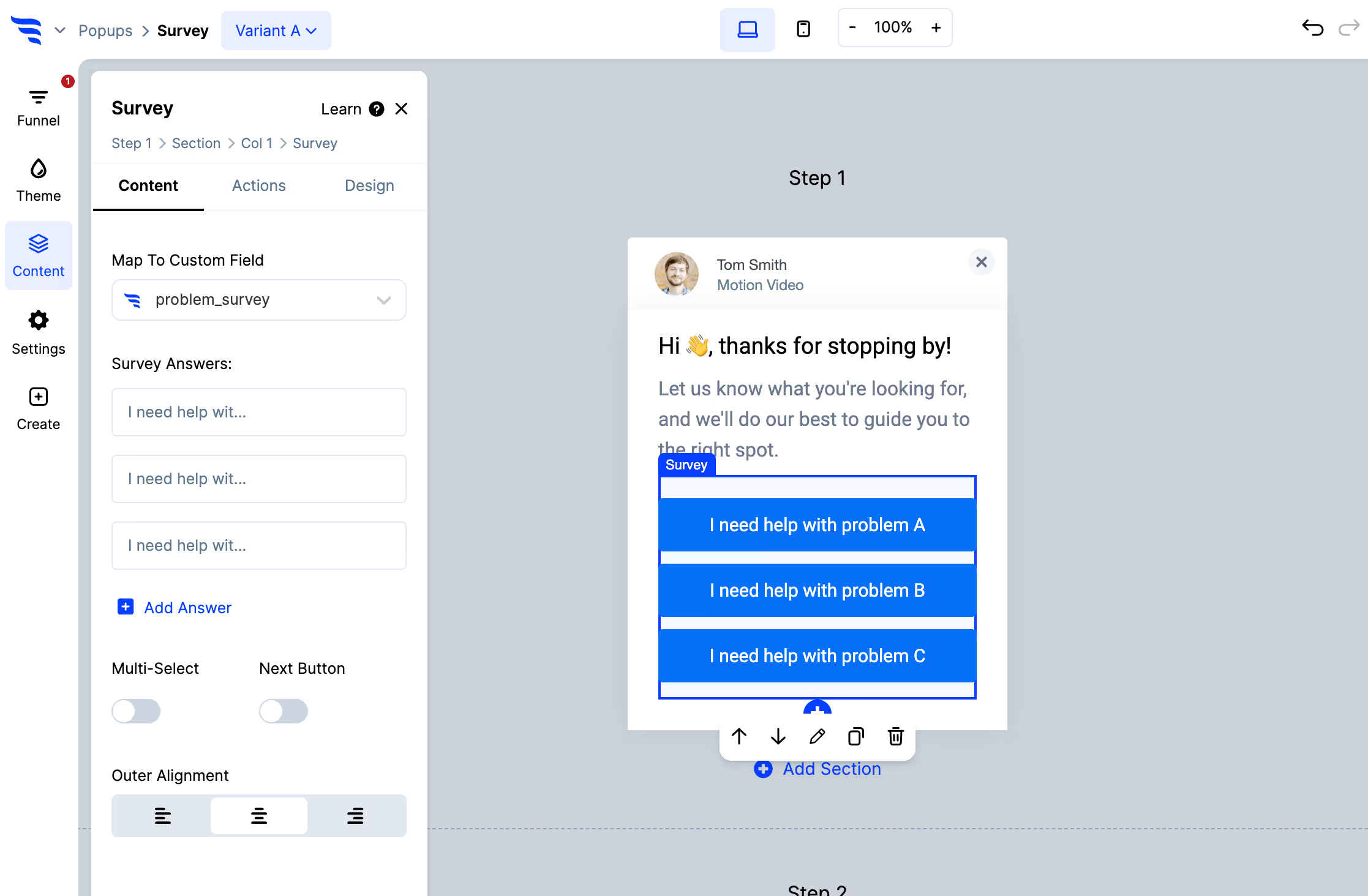
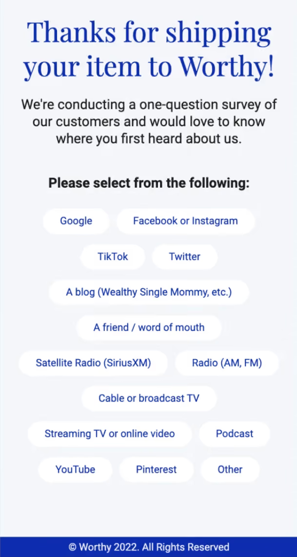
Fixed options answered with a tap. Emoji, icon or rating options work particularly well — they're understood at a glance and need no reading.
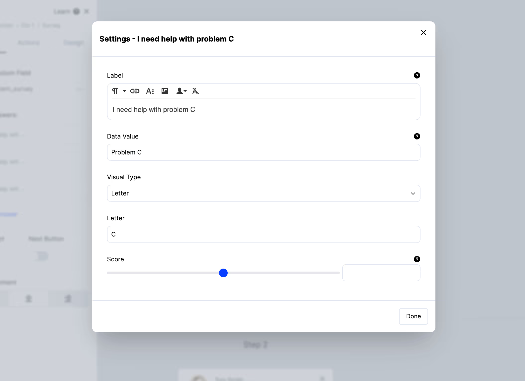
Keep the option count low too. Six options on a phone means scrolling within the survey, and anything below the fold effectively doesn't exist.
Step 2: Avoid open text
The single biggest completion-rate decision on mobile.
Asking someone to type a sentence on a phone is a different request from asking them to tap a button. If you need the detail, ask it as a conditional follow-up after they've already answered something — they've engaged, so the cost is lower.
Step 3: Size the tap targets
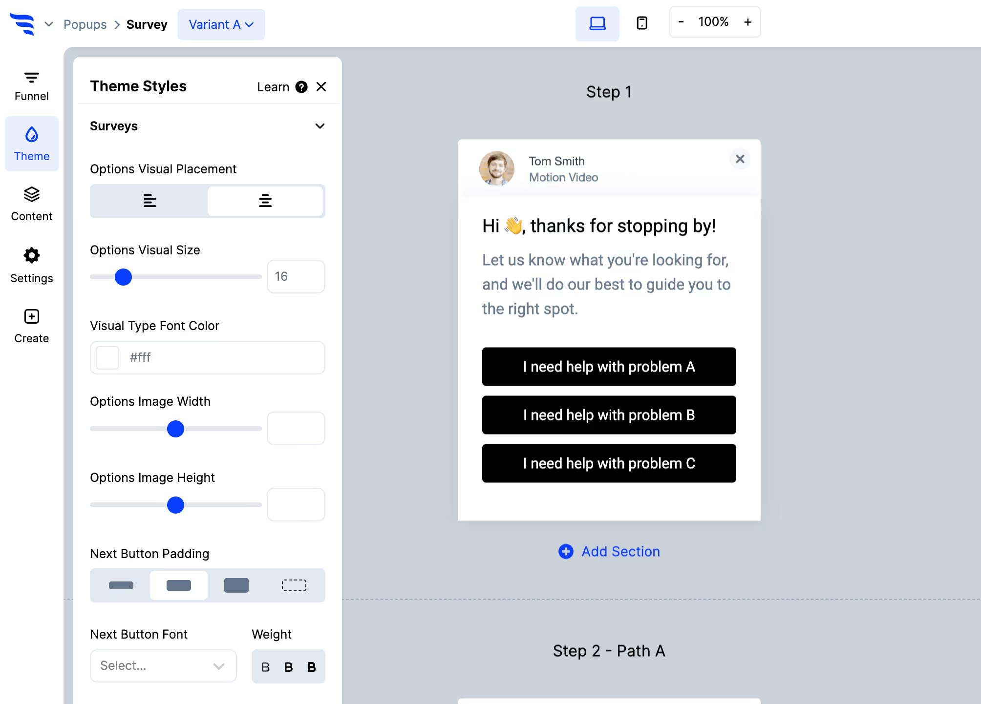
Options need to be comfortably tappable with a thumb, with enough spacing that neighbouring choices aren't hit by accident.
A mis-tap on a survey isn't just an annoyance — it's a wrong answer in your data that you can't distinguish from a real one.
Step 4: Anchor it at the bottom
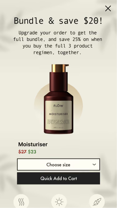
Use a bottom-anchored hook or an inline embed rather than a centered overlay.
Two reasons: the bottom of the screen is where thumbs are, and leaving the content visible keeps you clear of the intrusive-interstitial pattern.
Step 5: Trigger after engagement
A survey on arrival is worse on mobile than desktop — smaller screen, more disruption, and the visitor knows nothing yet.
Scroll point or a post-action moment works better. And set suppression, since a returning mobile visitor being asked repeatedly is a stronger irritation on a small screen.
Step 6: Check the close control on a real phone
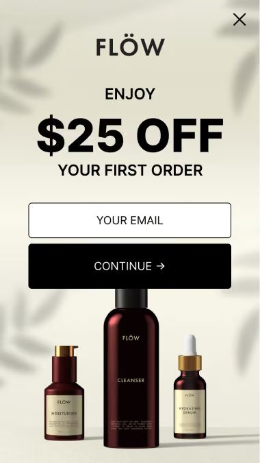
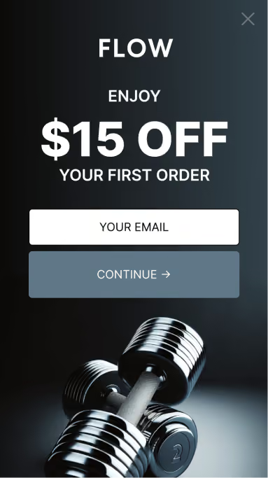
Reachable with a thumb, and visible against whatever sits behind it. Top-right corners are hard to reach on large phones, and a pale icon on a pale background is effectively no close button.
A survey people can't dismiss is worse than no survey.
Step 7: Sync and branch
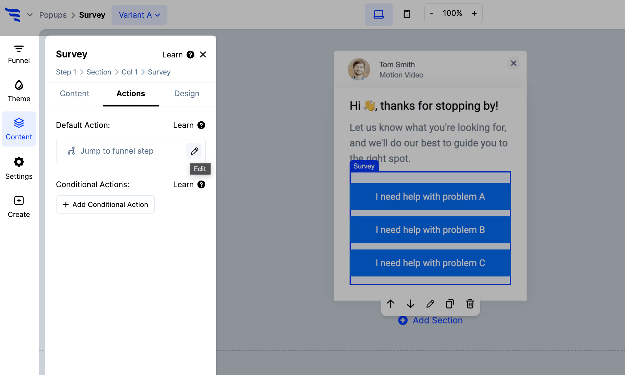
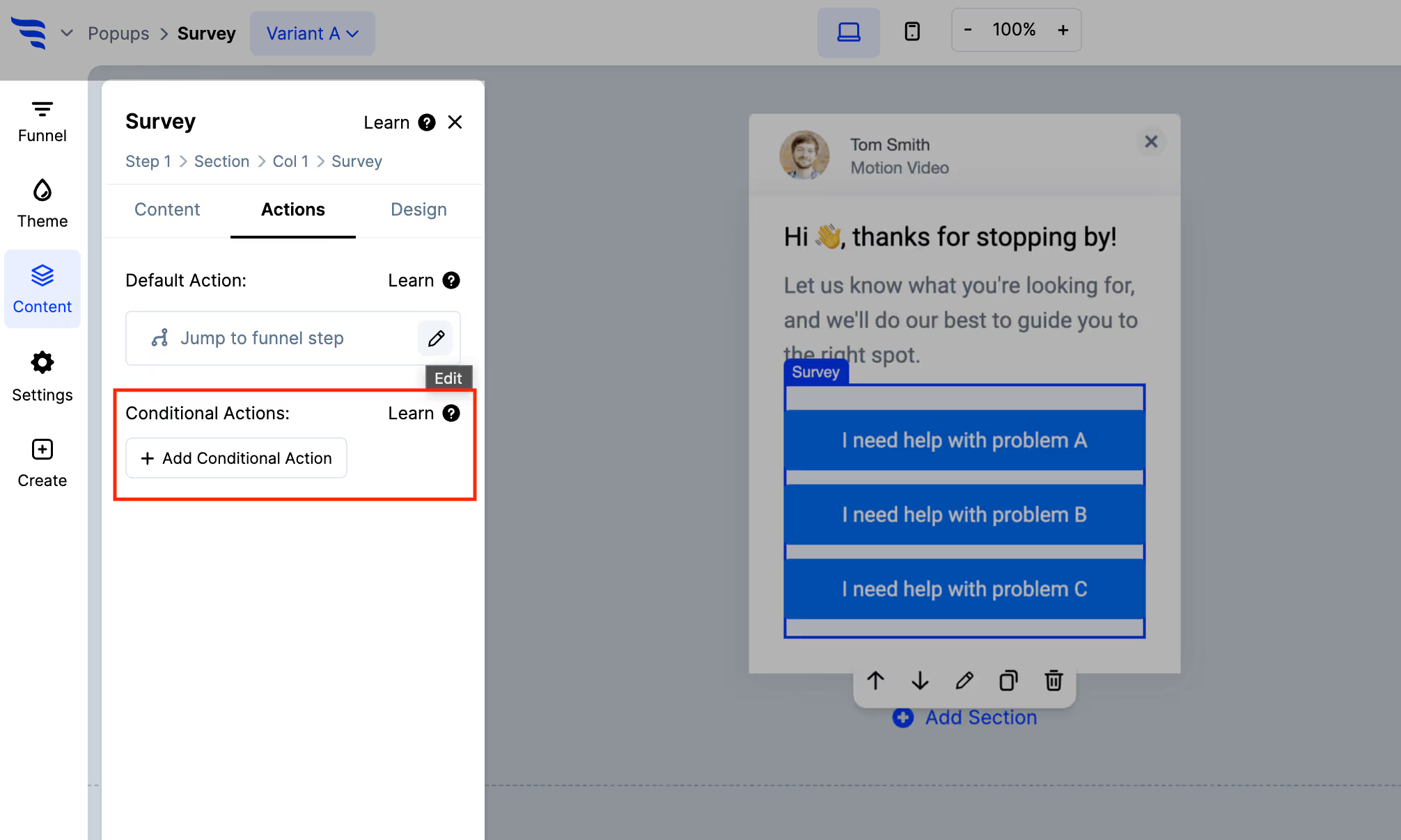
Map answers to fields and tags as usual, and use conditional actions for the follow-up.
Step 8: Read mobile separately
.avif)
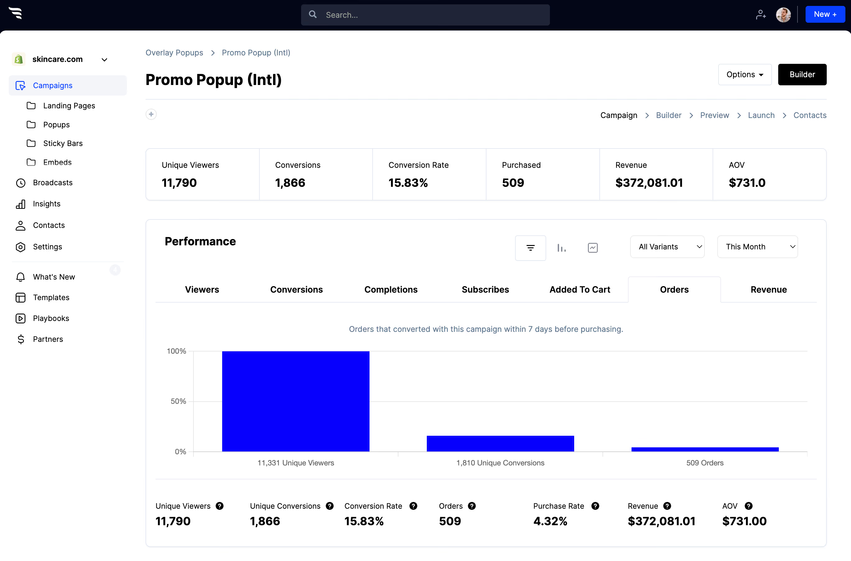
A blended completion rate hides the problem. Mobile almost always completes lower, and if you only look at the combined number you'll never find out which of the issues above is costing you.
Watch the answer distribution too — if one option is taking far more than its share, check it isn't simply the easiest one to tap.



%20(1).avif)






.svg)
