




Overlay pop-ups
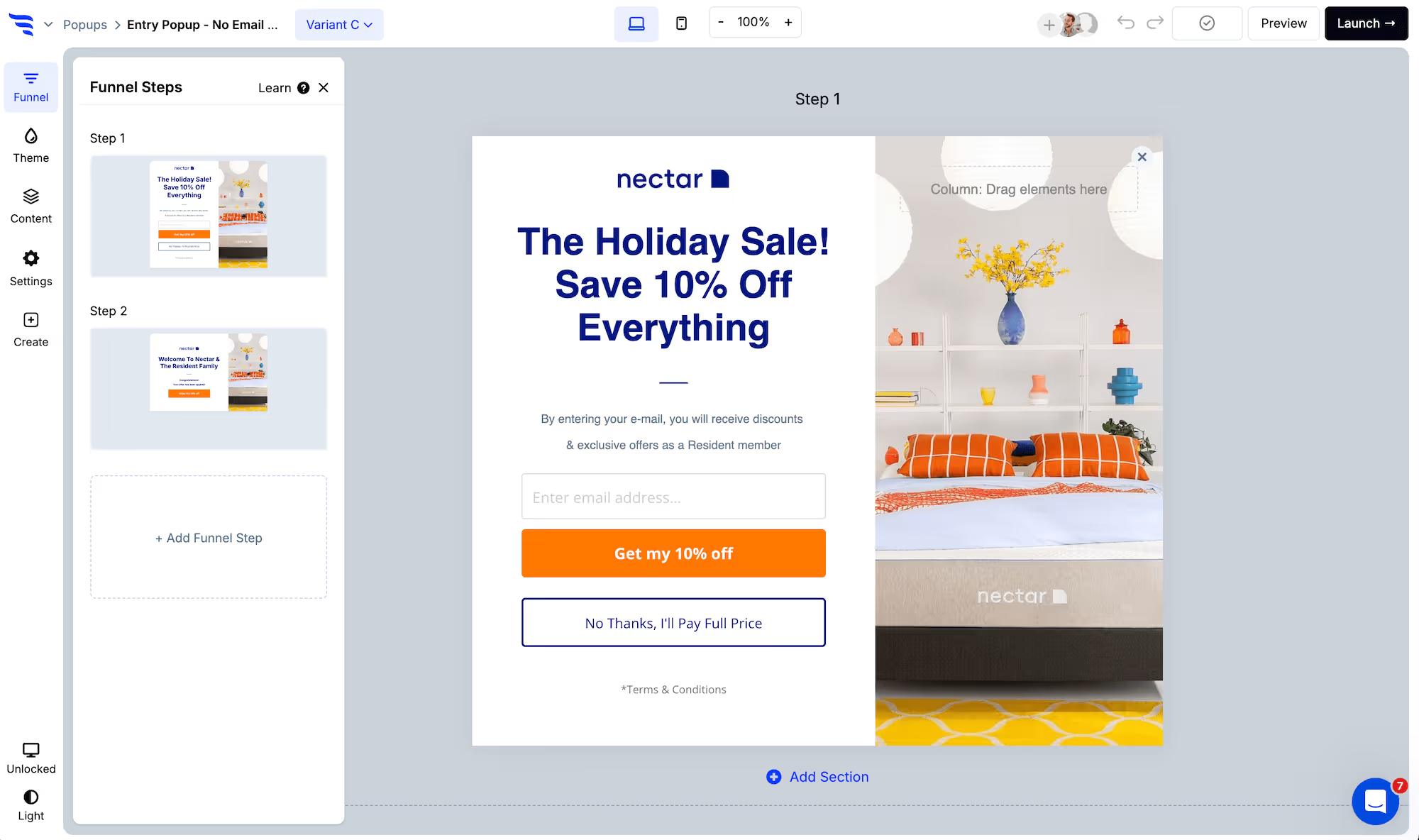
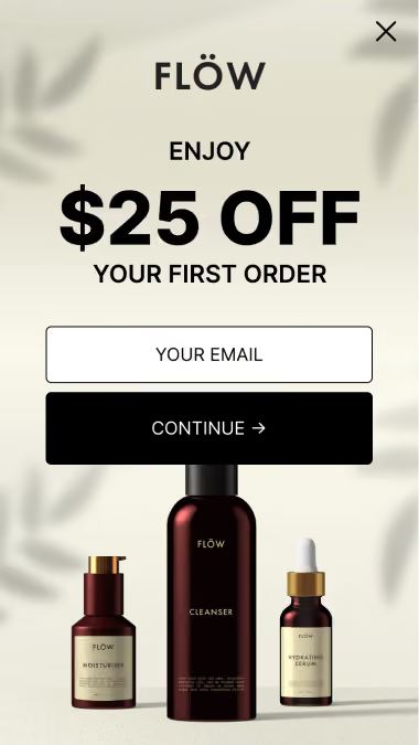
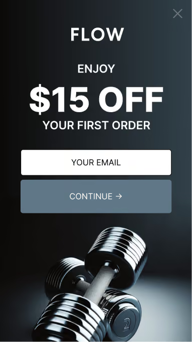
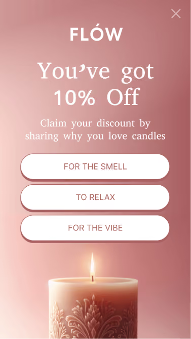
Targeted campaign that displays a large, centered pop-up. Great for commanding visitor attention when you need it.
Hook pop-ups
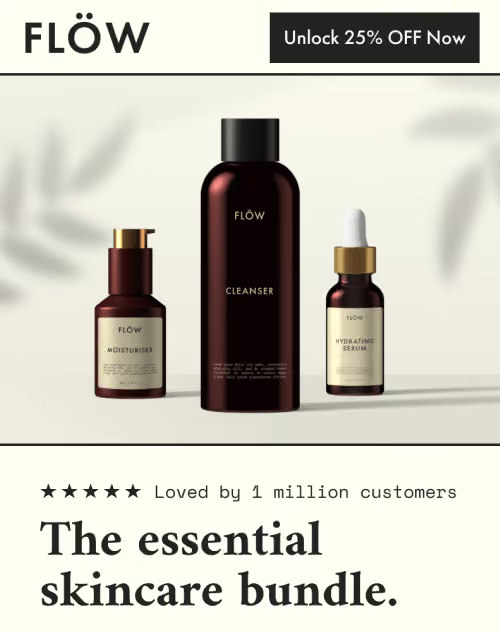
Targeted campaign that displays a smaller, left or right aligned pop-up. More subtle than overlay pop-ups, when you want to be less intrusive.
.avif)
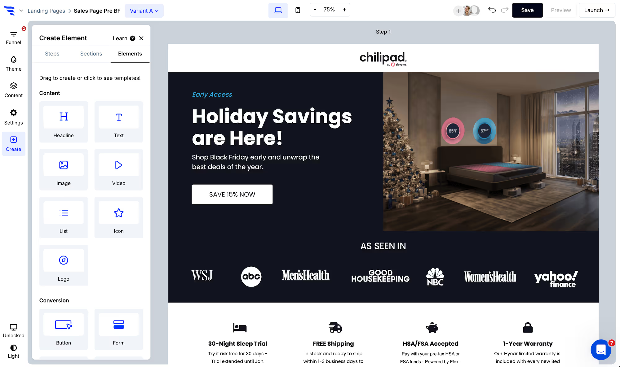
You'll then see lots of templates to choose from. Now, choose the template that's closest to your desired campaign. Preview it and then create a campaign using that template, or create from scratch.
.avif)
In the "Settings" tab of the builder panel, scroll down to find the pop-up trigger settings.
.avif)
Here you can choose the trigger type you want to use. Trigger types include:
Use the theme settings to customize the theme styles for the pop-up container size, close icon, headlines, buttons, etc.
.avif)
Click any element, or use the layer manager, to edit content.
For text elements, you'll find a text editor in the builder panel. Or, you can double-click text elements to edit content within the builder canvas.
Then, use the design tab to fine-tune each element's design.
.png)
Conversion elements are buttons, forms, quizzes, and product elements.
Customize content:
.png)
- Edit button element text
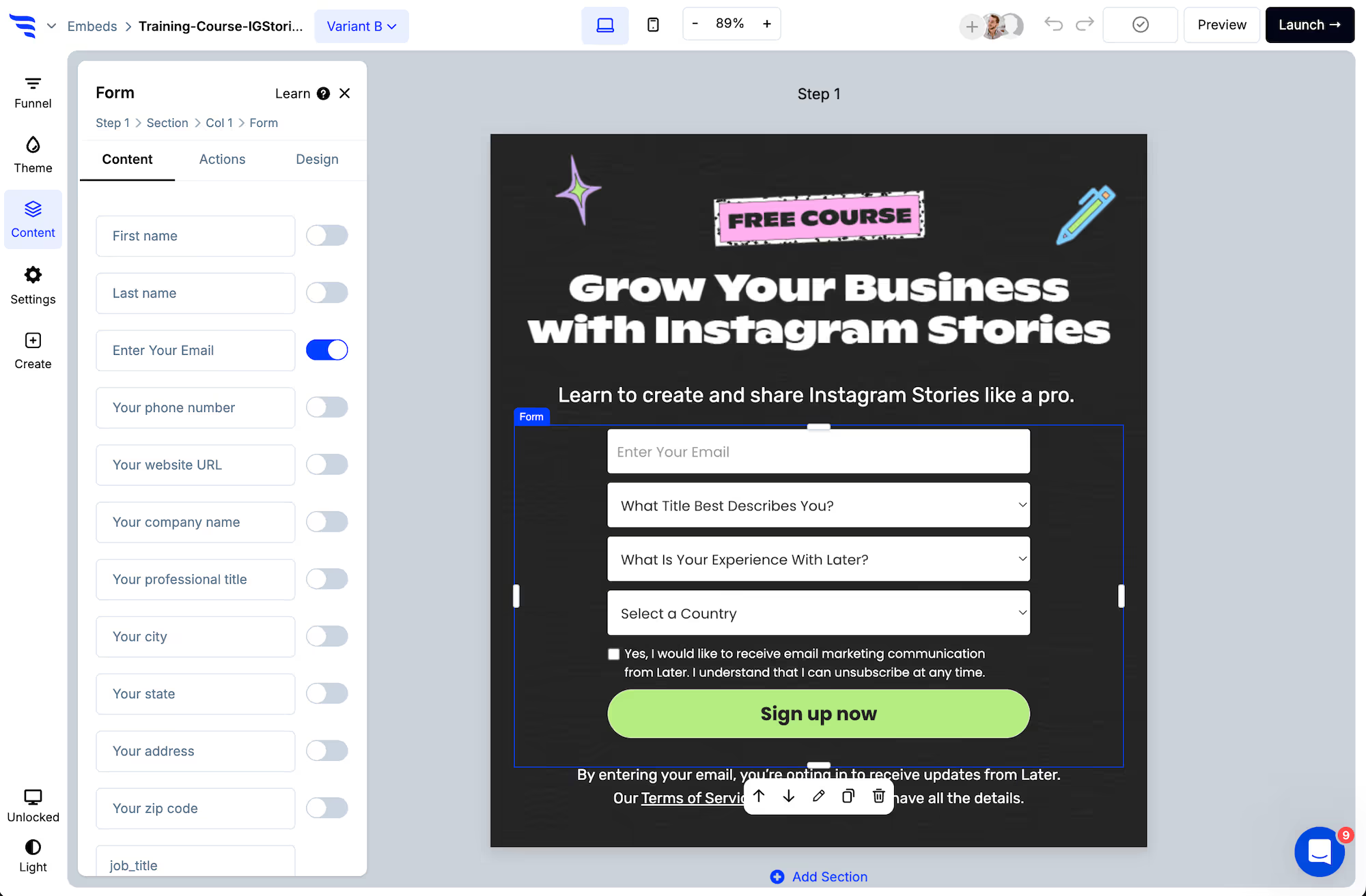
- Toggle contact fields and add custom fields to form elements
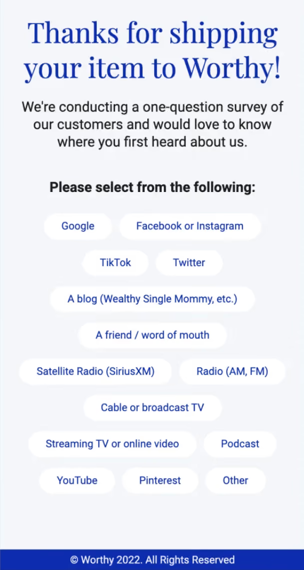
- Add options to survey elements
- Add questions and answers to quiz elements
- Filter product recommendations for product feed elements
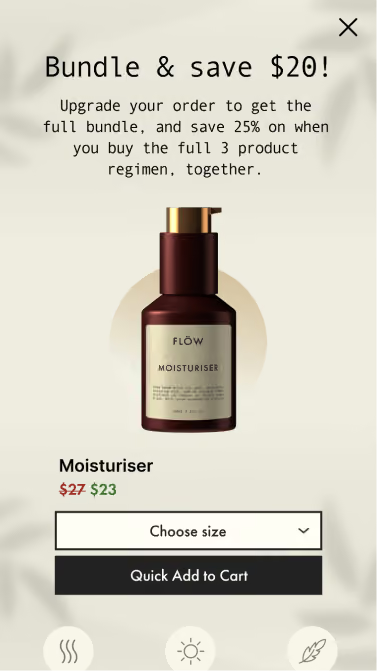
- Set the product content for product hero elements
Configure actions
Click to the Actions tab to set the default action.
Buttons, forms, quizzes, and surveys can be configured to jump to another funnel step, redirect to a URL, redirect to cart, display another pop-up campaign, etc.
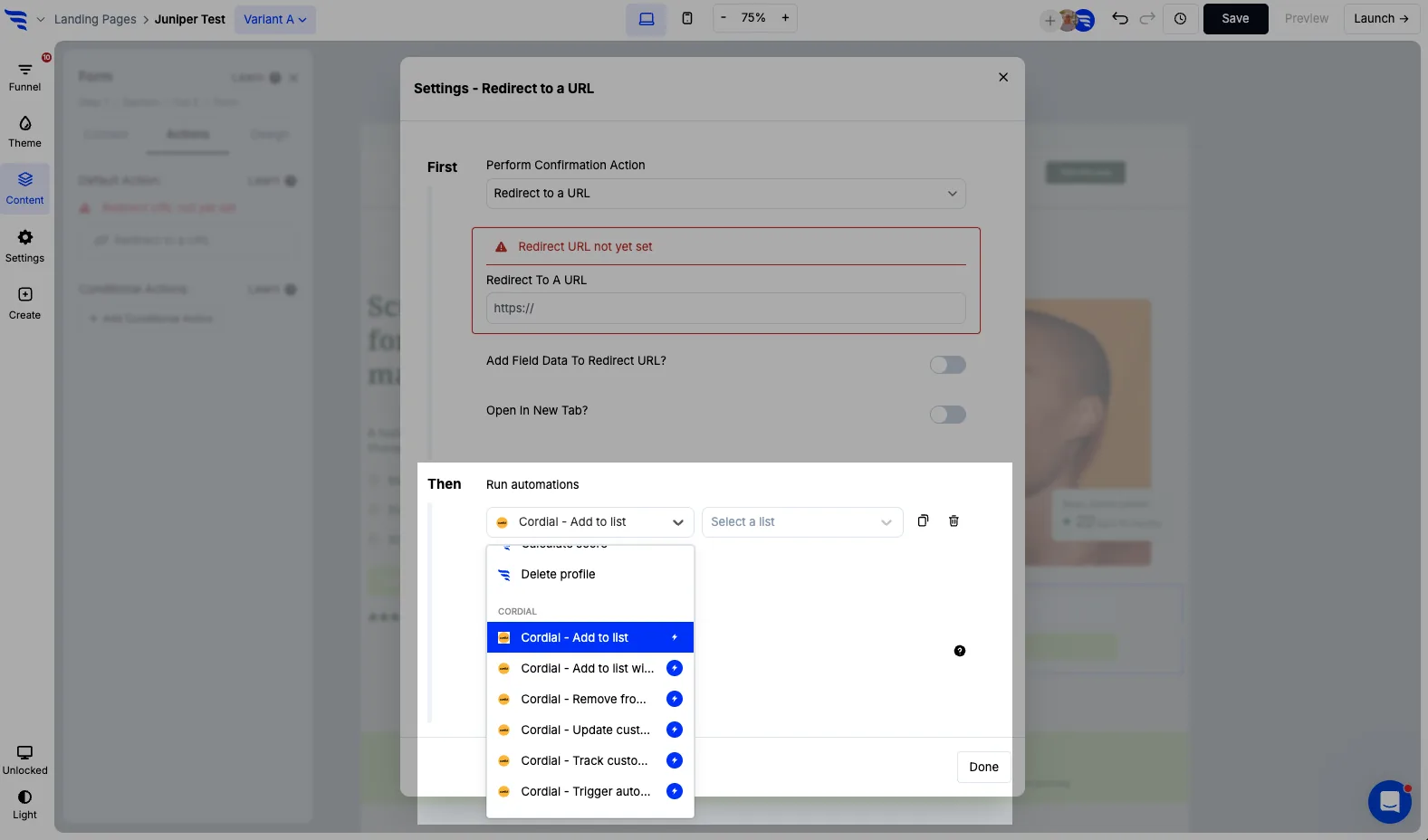
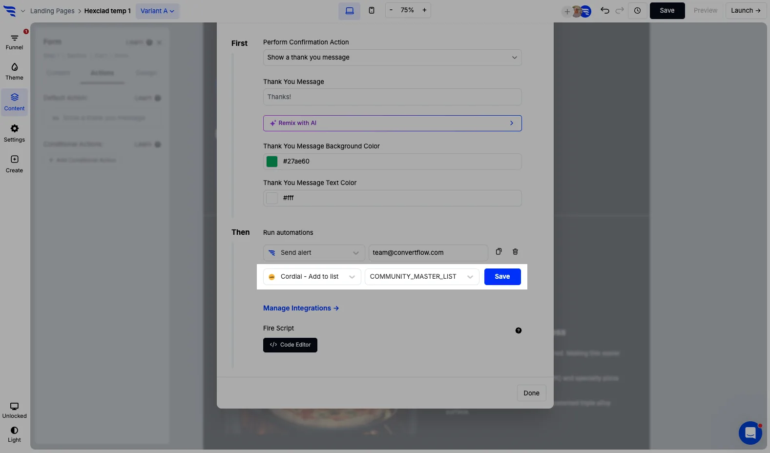
Here you can also add automations to run in the background, such as adding contacts to a list in your email providers.
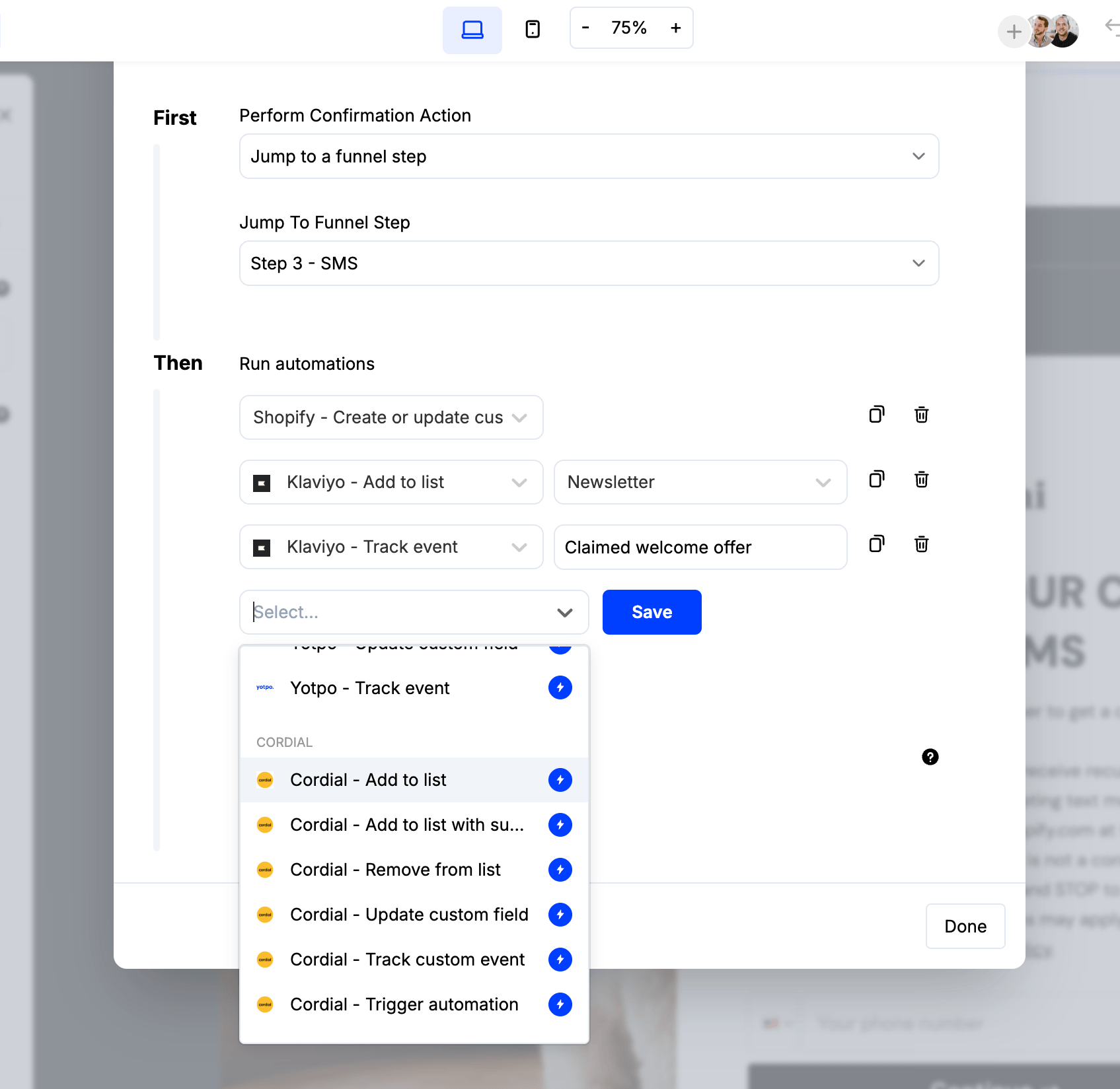
Use these to define scenarios using conditions, where a different confirmation action is displayed and additional automations trigger, such as jumping to a different funnel step and applying an additional CRM tag based on a quiz answer combination.
Configure product filters
Select product elements, and you'll be able to configure the products to showcase in the settings to the left.
.png)
Product feed elements will have settings to configure a products filter, such as products in a certain collection.
Product hero elements have 1 product that shows, so you can select it from the dropdown.
Each type of product element allows for adding conditional product recommendations, which let you use conditions to showcase the right products, based on conditions such as quiz answers, products in the cart, etc.
Set product button actions
If adding the product to cart, you can optionally configure the 2nd button text and what happens upon the 2nd button click, such as whether this 2nd click redirects shoppers to their cart, checkout, another funnel step, a URL, etc.
.png)
.png)

.avif)
.avif)
.avif)
.avif)
.png)
.png)
.png)
.avif)


%20(1).avif)




.svg)
