6 Giveaway Landing Page Examples You Can Copy Today (with Templates)
A winning giveaway landing page does two things: builds hype around the contest and provides participation details. Learn how these six giveaway landing page examples succeed at doing this, plus grab the templates to create your own today.
Giveaways are an effective way to increase brand awareness and collect lead information.
But, their entire success depends on how well you design your giveaway landing page—a place where you share the benefits and rules of participation. Go wrong here, and you’ll fail to get the traction that your contest deserves.
So, in this post, let’s make sure that doesn’t happen by diving into what makes a successful giveaway landing page and looking at six giveaway landing page examples that are rocking it. We’ll also give away (no pun intended 😄) templates to create your page today.
What is a giveaway landing page?
A giveaway landing page is designed to encourage people to join your giveaway by creating excitement around the prizes and providing details to participate.
Sure, you can announce giveaways on your homepage or blog page. But those pages tend to be crowded with multiple CTAs such as social sharing buttons, signup forms, and more. These take the focus away from your giveaway, making it less likely for people to participate.
To top that, they do little to build excitement around entering the content. With insufficient details, you’re also likely to lose interested people. It’s why a dedicated giveaway landing page is essential for announcing, building hype, and providing stepwise participation details.
So what does a high-converting giveaway landing page include? Keep in mind the following six elements:
Giveaway landing page best practices
Attention-grabbing headline. You need to hoko people in right away with a headline spotlighting what participants can win.
Visually engaging imagery. Not always necessary, but it's usually a great idea to include a strong image of prizes/rewards to build excitement.
Benefits of taking part. Share the benefits of joining the giveaway by clearly highlighting the prizes participants can win.
Clear entrance instructions. Explain exactly what interested folks need to do to enter the contest. If there’s more than one thing to do, layout the process in steps.
Short entry form. Make sure you ask for the needed details only, capturing at least an email address—making the process as frictionless as possible.
On-brand design. Select your brand fonts, design elements, and colors to design the page for familiarity.
Now let's take a look at these points in action 👇
6 giveaway landing page examples
Now that you know what makes a winning giveaway landing page, let’s look at some examples to see how others put all this theory into action.
This example giveaway landing page starts with an attention-arresting, high-quality header image that captures the giveaway in summary—create your own nacho recipe:
It’s paired with an enticing headline highlighting what participants can win.
See how the header section is a catchy shade of red that complements the rest of the black-colored landing page. Not only is this an interesting contrast (and an on-brand one for Doritos), but it’s worth noting how they’ve used the colors to draw focus on the header section.
The page also does a beautiful job of sharing giveaway participation steps briefly and clearly. These are followed with a clear CTA—a shade of yellow on black for getting the audience’s attention.
The landing page then goes one step ahead, sharing a short entry form for those who aren’t on Instagram. And, finally, there are some pictures of nacho recipes for inspiration.
2. Corkcicle EPCOT® giveaway landing page
Here’s a short, to-the-point giveaway page example from Corkcicle:
The landing page is designed to align with Corkcicle’s brand colors (white and black). But, there’s an image of the EPCOT festival in the background to build excitement and hint at what the giveaway is about.
What’s more:
The header is clear, specifying exactly what people will win by participating. The copy then dives into the benefits—outlining everything that’s included in the giveaway.
Like the rest of this giveaway landing page, the entry form is brief, only asking for the necessary details. This makes it uber-simple for interested folks to join.
Lastly, the page briefly addresses participation rules while sharing a link to the detailed rules that visitors can read just below the CTA button.
And, to reinforce the message, there’s a timer at the end of the page that’s live counts the time left for people to join—subtly building the hype 💪
3. ColourPop giveaway landing page example
ColourPop has designed this landing page according to its new collection’s theme–complete with the CTA button being a contrasting shade of green:
The page starts with an announcement of when the new collection will launch. This is followed by a line explaining what people need to do to win the new collection.
See how they’ve capitalized and used a darker shade to write "win" in the copy? This helps them grab visitors’ attention while stoking their excitement too.
The page then simply asks for participants’ emails. And to answer anyone’s question on how they’d know if they’ve won, ColourPop specifies the next steps in small font under the CTA button.
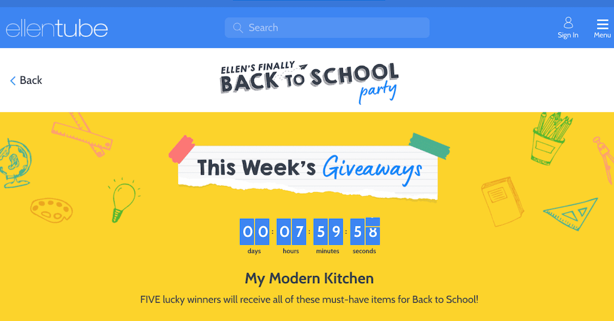
4. Ellen’s back to school giveaway landing page
This landing page starts with a “this week’s giveaway” banner image, which suits it just fine as Ellen hosts weekly giveaways:
It’s followed by a countdown timer that creates a sense of urgency to encourage folks to join.
The page then focuses on the prizes that five lucky people can win. The interesting part? Instead of listing the rewards, the page features images of products showcasing their descriptions along with their retail value. This helps participants estimate the worth of the prizes they can win simply by entering the lucky draw.
Another thing that this giveaway landing page example does differently—it shares a CTA button, not a short form, that takes visitors to another page asking for their email.
5. Muddy Bites monthly giveaway landing page example
Next, we’ve another simple landing page example from Muddy Bites:
This page is designed to be on-brand with clear, converting copy explaining the benefits and participation instructions.
The icing on the cake: a fun illustration of their product with a quotation box asking for phone numbers to increase winning chances—a smart way to get leads into the SMS sales funnel.
To build the interest even more, the page links to all the courses they’re giving away. Lastly, it shares student testimonials to further drill home the giveaway’s worth–giving people more reasons to participate.
6 giveaway landing page templates
Buzzing with ideas to create your own giveaway landing page? Use ConvertFlow to create landing pages yourself—no outside help needed.
Start by choosing from a pool of landing page templates. Here's a few of our top giveaway landing page templates that you can customize and use right away:
Masooma is a B2B writer for SaaS who has worked with awesome publications like Hootsuite, Vimeo, Trello, Sendinblue, and Databox among others. You’ll usually find her writing in-depth content, making to-do lists, or reading a fantasy novel.
Explore more campaigns
Get more inspiration from examples of other popular conversion marketing campaigns


.svg)
